iOS Rebuild and File Library Restructure
Rebuilding the Oracle Prime Field iOS client around Apple's interaction patterns, restructuring the file library so drawings live under their trade, and shipping a custom icon font for the construction vocabulary iOS didn't cover.
- Role
- Sole Product Designer — audit, IA, UI system, icon system, spec handoff
- Year
- 2019 — 2020
- Platform
- iOS (iPhone + iPad), Sketch, Figma, Custom icon font
- Industry
- Construction Technology · Field Operations
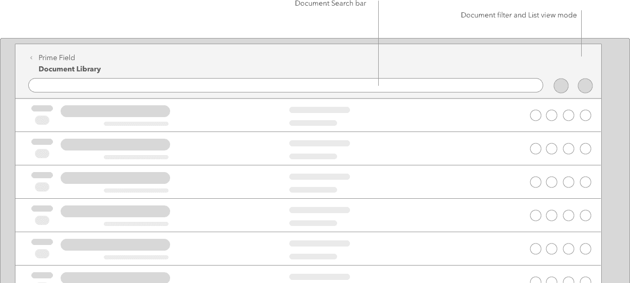
The iOS client had been shipped years earlier and left alone since. It behaved like a port of an old web view, ignored most of Apple's Human Interface Guidelines, and buried the two most-used surfaces in the app: the "add" action and the drawing library. I rebuilt it. That included an audit-and-bug pass, iOS-native navigation and interaction patterns, a file library reorganized around drawings-per-trade with a dedicated plan-central view, a document and markup layer built for real jobsite use, and a custom icon font so the app could name construction concepts precisely instead of leaning on stock pictograms.
Latista's iOS app had been shipped, patched, and largely left alone. It ran, but it wore its history on its sleeve. Screens felt like web pages wrapped in a shell. Gestures behaved unlike anything else on the phone. Iconography was a mix of stock glyphs that didn't map cleanly to the work.
That matters more than it sounds. iOS users have strong pattern expectations about where the primary action lives, how a modal dismisses, what a swipe does, and what a segmented control means. When an app violates those expectations, users don't call it a bug. They just slow down. On a jobsite where a foreman has thirty seconds between stations, being a little slower is the difference between using the app and going back to paper.
Three months of field research had also made the systemic issues clear. The primary add action was findable only if you already knew where it was. The issue-creation form was longer than a punch walk could survive. The file library kept every project drawing in one flat pile with no notion of trade. The iOS rebuild was the chance to fix all of that together.
What was broken.
Three problems in one release.
The first was platform alignment. Real Apple HIG alignment, not cosmetic changes. That meant native nav bars, tab bars, action sheets, sheet presentations, swipe gestures, dynamic type, and safe-area handling. iOS users behave with the platform a specific way, and the app needed to reward that behavior instead of fighting it.
The second was the file library. Construction drawings live in a strict hierarchy: discipline (electrical, plumbing, structural, mechanical, architectural), sheet type, revision, and area. Flat storage threw all of that away. A plumbing foreman scrolling past four hundred electrical sheets to find their own is not a UX problem, it is a workflow blocker.
The third was iconography. Construction has vocabulary that Apple's SF Symbols didn't cover: punch, RFI, submittal, plan, sheet, trade, deficiency, markup layer, redline. A generic stock icon set kept forcing us to overload symbols. A custom icon font let the app name concepts in glyph form, at any size, in any color, without a separate asset pipeline.
Workflow first — three user surfaces, one rebuild
I split the rebuild by user surface rather than by screen. Each surface got mapped as a flow: what the user opens the app to do, what they hit next, and where the current app failed them. Then I picked the interaction pattern from Apple's vocabulary that actually matched the flow, rather than the closest lookalike.
The file library got the deepest surgery because it had the deepest structural problem. The rest was interaction patterning. The library was information architecture.
- 01
Land in the app with a native tab structure
The custom in-app navigation was replaced with a standard iOS tab bar. Issues, Library, Plans, More. Every top-level surface is reachable in one tap from anywhere in the app. Primary actions are no longer hidden inside nested menus.
Foreman / Superintendent - 02
Add an issue with a visible primary action
The create-issue action is promoted to a persistent, high-contrast button in the tab bar area. iOS users expect the add action to be visible and thumb-reachable. This version puts it where they look for it.
Foreman / Superintendent - 03
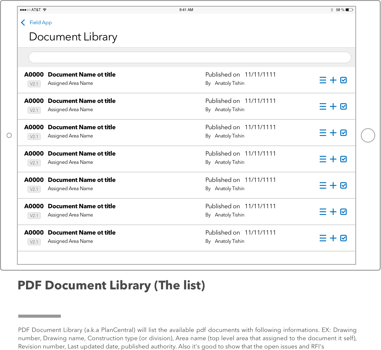
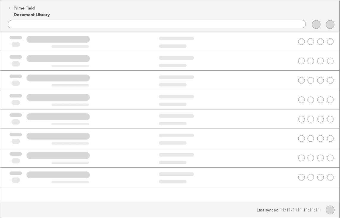
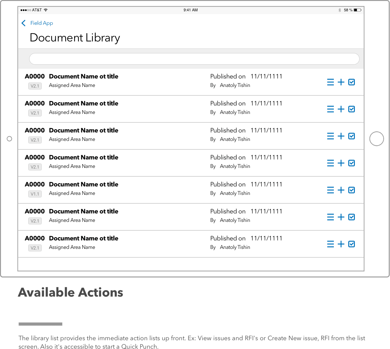
Open the Library, grouped by trade first
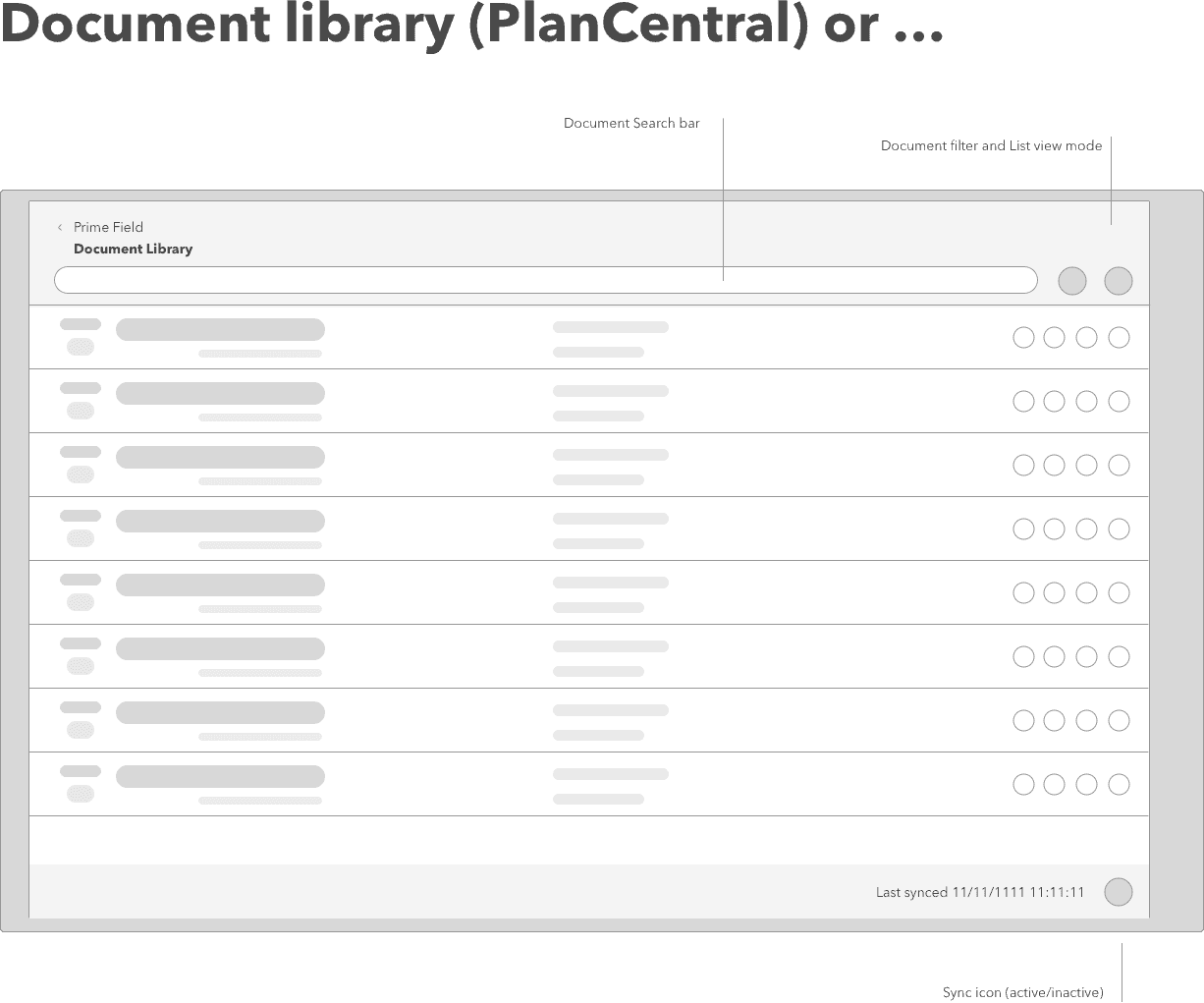
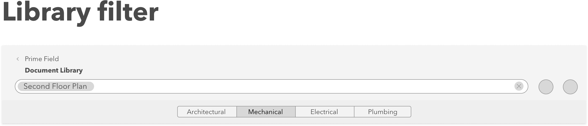
The library is restructured into a two-level tree. Discipline at the top (Electrical, Plumbing, Structural, Mechanical, Architectural), then area or sheet type underneath. Drawings-per-trade means an electrician sees electrical sheets first and everything else is one tap away.
Foreman - 04
Preview a drawing with side-panel context
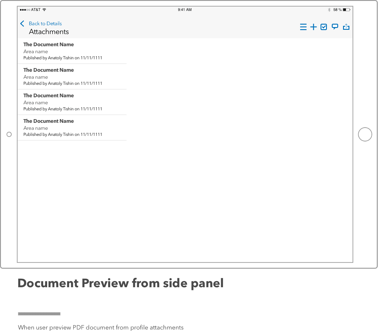
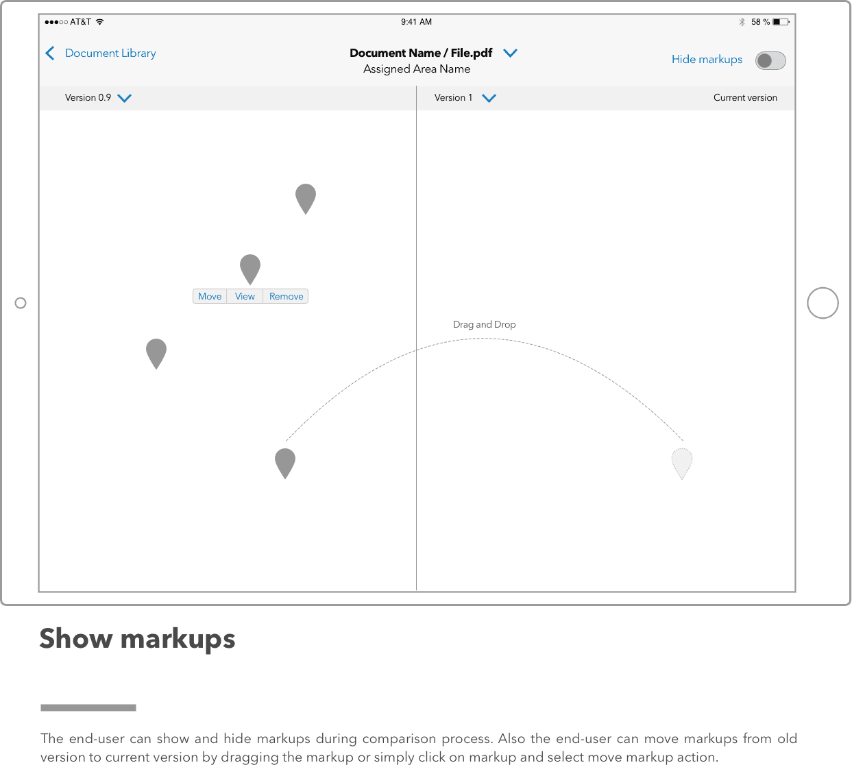
PDF preview opens with a right-side panel that carries version history, markup layers, and metadata inline. iPad presents it side-by-side. iPhone slides it in. Cross-referencing a revision no longer means jumping between tabs.
Foreman / Superintendent - 05
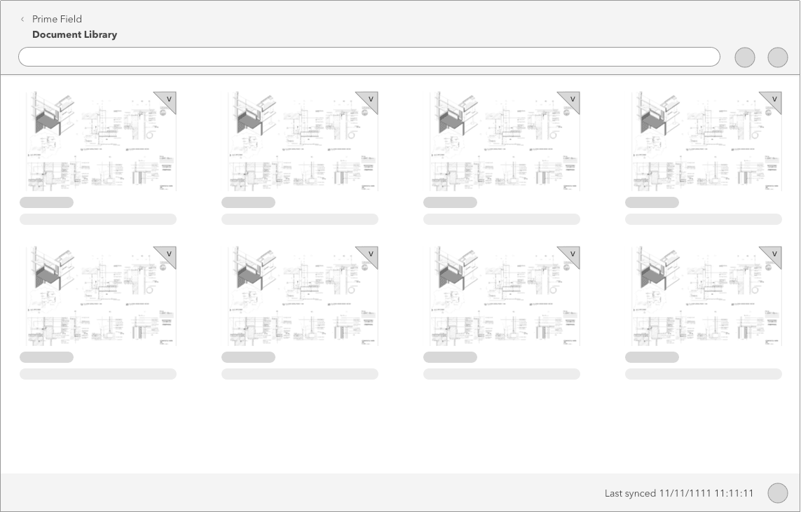
Pick a version by looking at it
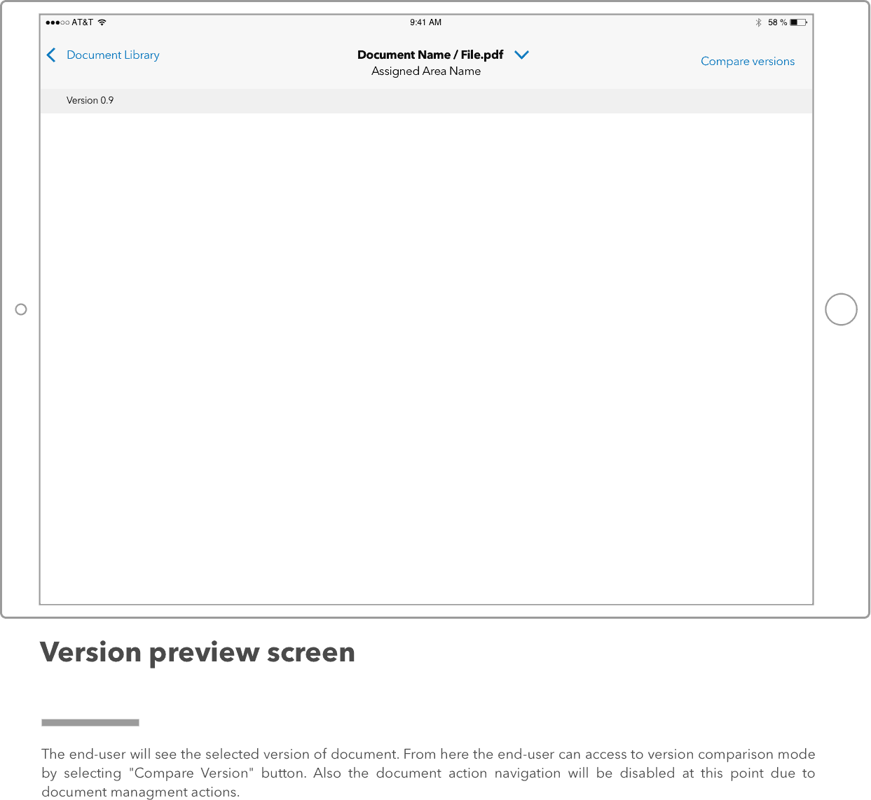
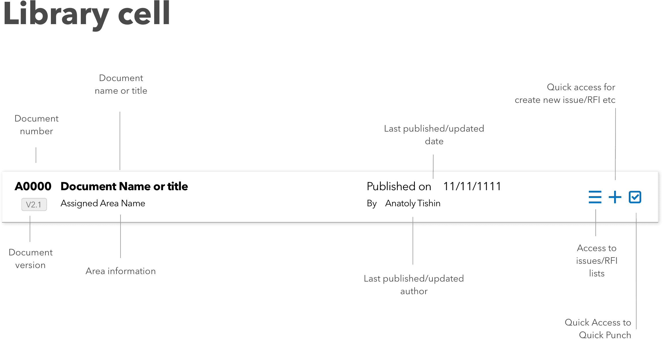
The version selector shows a thumbnail per revision instead of a filename list. Comparing Rev 03 to Rev 04 becomes a visual comparison rather than a text decode.
Foreman - 06
Plan Central — the whole project at a glance
A new Plan Central surface indexes every active plan sheet across every discipline, filterable by trade and area. This is where a superintendent lands when they need to answer a question like 'what do we have on floor 12 for HVAC.'
Superintendent - 07
Contextual actions in a native action sheet
Assign, share, mark up, and add to punch list all live in an iOS action sheet. Predictable position, predictable dismissal, VoiceOver support included.
Foreman / Superintendent - 08
Markup as a managed layer
Markups are organized as named sets: per user, per date, per discipline. Each set can be toggled on or off in the preview so redlines from different reviewers don't stack into one unreadable overlay.
Superintendent
From tangled to shipped.
Audit what was on iOS and what was off it
I went screen by screen through the existing app and tagged every deviation from iOS conventions. Custom navigation where a native nav belonged. Custom menus where an action sheet belonged. Buttons in the top-left doing back navigation without a chevron. Gestures that fought Apple's system gestures. The audit ran long, which told me the surface area of the problem before I started drawing.
Re-map the file library IA
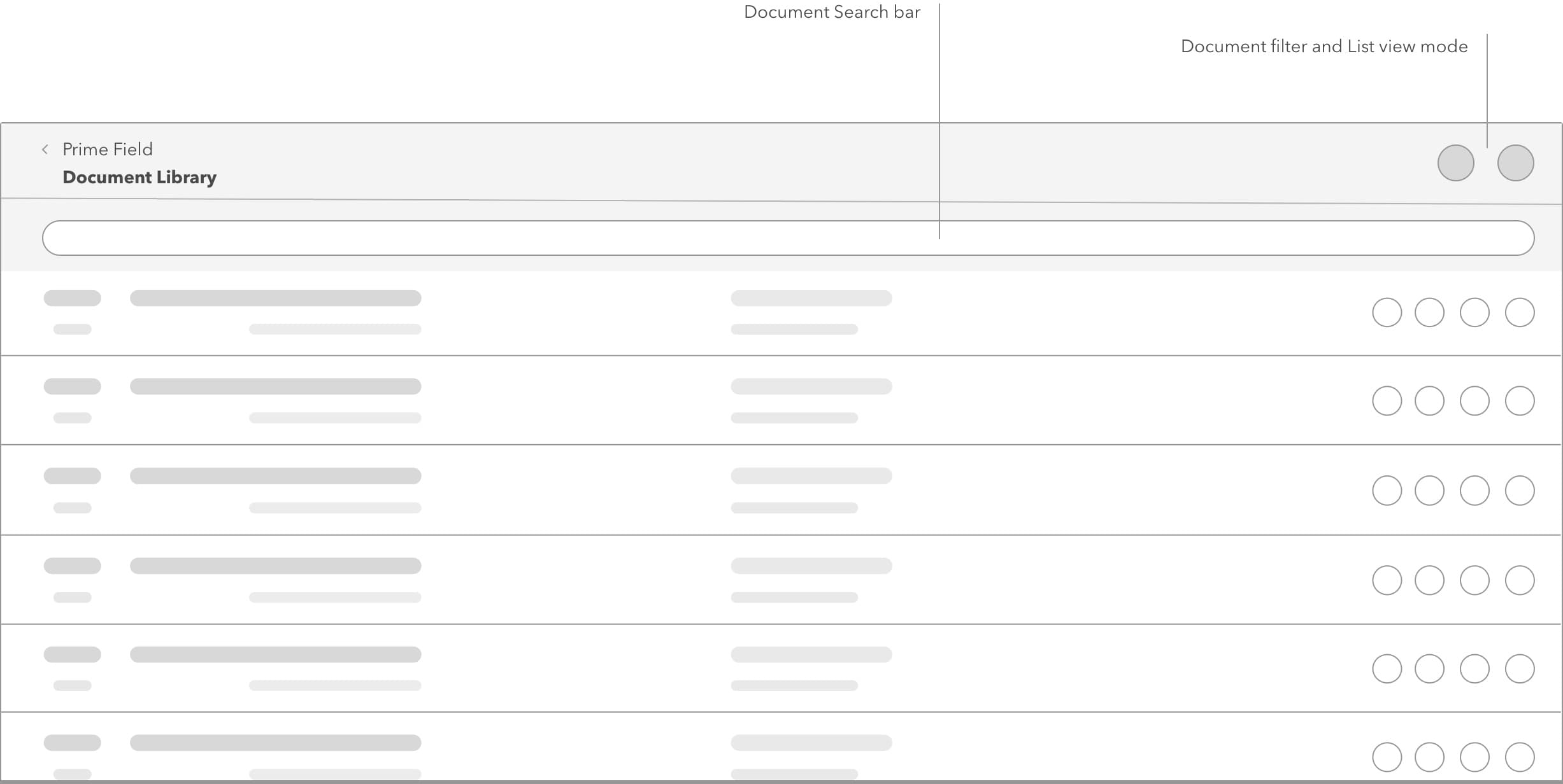
The library rebuild was the largest information architecture move in the project. I sat with GC document controllers and subcontractor foremen and drew the mental model they actually used: discipline first, area second, revision third. The flat list matched none of that. The new IA nests drawings under their trade so a foreman opens the app and sees their own world first.
Plan Central came out of the same conversations. Superintendents kept asking for a single place where they could see every sheet, so I built that as its own tab.
Design the custom icon font
I sketched an icon set specifically for construction concepts iOS didn't have symbols for: trades, punch items, RFIs, submittals, markup, revision. I drew them on a shared grid with unified stroke weight, and gave them optical sizing so a 16pt tab-bar icon and a 44pt header icon both read cleanly. Packaged as a font, the app could color and size them as text with no bitmap pipeline.
Redraw the screens against Apple HIG
I rebuilt every affected screen against Apple's Human Interface Guidelines. Real nav bars with proper titles. Sheet presentations for modal work. Segmented controls in place of the old app's bespoke tab strip. Native action sheets for contextual actions. I also picked up dynamic type support and safe-area handling on the way through. Both had been ignored in the original app.
Bug pass alongside the redesign
The rebuild was also the moment to close a long tail of small bugs QA had been triaging around: dismissals that stole focus, wrong-orientation locks, the keyboard covering inputs, sync spinners that never resolved. The redesign work naturally rewrote most of the offending surfaces. The rest I flagged for engineering as we went.
Spec and handoff
I handed off in Sketch (later Figma), with the icon font, the new component patterns documented, and the Plan Central IA drawn out as a tree. I worked with engineering through the build to keep the interactions honest. The moment a native pattern gets "close enough" faked, you end up back in the old app.
The moves that worked.
Native iOS chrome throughout
Custom navigation was replaced with iOS tab bar and nav bar patterns. Contextual actions moved into native action sheets. Modals present as sheets rather than full-screen custom overlays. The app matches what an iOS user's thumb is already trained to expect.
File library reorganized around trade
Drawings are grouped by discipline first (Electrical, Plumbing, Structural, Mechanical, Architectural), then by area and sheet type. A plumbing foreman sees plumbing sheets first. The flat dump is gone.
Plan Central for every sheet in the project
A dedicated surface indexes every active plan sheet across every discipline, filterable by trade and area. The answer to "what do we have on floor 12 for HVAC" is one screen away.
Document preview with a side panel
PDF preview brings version history, markup layers, and metadata inline through a side panel. iPad shows it side-by-side; iPhone slides it in. Checking a revision no longer means losing your place.
Version selector with visible previews
Revision selection shows a thumbnail per version instead of a filename list. Comparing Rev 03 to Rev 04 becomes a visual decision.
Markup management with named, toggleable layers
Markups are organized as named sets per user, date, and discipline. Each set can be toggled on and off in the preview, so multiple reviewers' redlines can coexist without turning into a mess.
A custom icon font for the domain
A construction-specific icon set drawn on a shared grid and packaged as a font. Trades, punch items, RFIs, submittals, markup layers, and revisions each get their own glyph. Because it's a font, the app can color and size icons as text at any resolution, with no separate asset pipeline.
Contextual actions in native action sheets
Assign, share, mark up, add to punch list — all moved into iOS's native action sheet. Predictable position, predictable dismissal, and VoiceOver support come with the pattern.
Screens and scraps.

What shipped. What changed.
What shipped: an iOS client that behaves like an iOS client. The tab bar surfaces the primary destinations one tap deep. The file library respects how construction teams actually organize drawings. Plan Central gives superintendents one place to answer plan questions. Markup layers became something you can manage rather than something you draw over the top of.
I don't have public post-launch adoption or velocity numbers to share. Enterprise B2B metrics rarely leave the account team, and I would rather leave a gap than invent one. The piece of work I'm most attached to is the custom icon font, because building it forced the whole product to name its concepts precisely.
“What I would do the same way: design to the platform's grain instead of trying to unify iOS and Android under one bespoke look. The Android app had earned its own patterns. The iOS rebuild deserved iOS patterns, and forcing a shared UI would have made both worse. What I would change: I would start the icon system earlier and use it as the source of truth from day one. On this project the icon font came in mid-flight, which meant retrofitting screens that had already been drawn with stock icons. Next time, icons first, screens second.”
Latista Foreman App
A mobile issue-resolution app for the subcontractor foremen on the other side of Latista's construction QA platform.