Latista Foreman App
A mobile issue-resolution app for the subcontractor foremen on the other side of Latista's construction QA platform.
- Role
- Product Designer — flows, wireframes, visual design, spec handoff
- Year
- 2016
- Platform
- Android (Material Design), iOS (companion concepts), Sketch, PDF flow documentation
- Industry
- Construction Technology / Field Operations
Latista is a construction QA platform that general contractors use to run punchlists across large commercial projects. The desktop side was already working well for GCs and project managers. This project (internal ticket MBL-2033) built the Android app for the other end of the loop: the subcontractor's foreman who walks the floor, does the fix, and needs to prove it was done. The whole design was built around one constraint. A foreman gets credentials from the GC, opens the app cold, and has to be productive inside a minute. No training, no manual, no walkthrough.
Latista is a construction QA and punchlist platform used on the kind of jobs that have dozens of subcontractors, hundreds of floors, and thousands of open items at any given moment. The desktop product was already in good shape for the GC and project manager audience. What was missing was the app for the other end of the loop: the subcontractor's foreman doing the physical work.
The scenario is straightforward. The GC assigns an issue in Latista ("wrong chandelier, Building M, 56th floor, conference room"), and the subcontractor's foreman needs to see it on their phone, walk to the location, fix it, and close it out with photo proof. On paper this is simple. On a jobsite it is not.
One note on the source material: the archive folder from that time is labeled "Foreman App" but also contains some unrelated consumer service-booking wireframes at the top level. The Latista work — the Android issue-resolution flow, the Sketch files, the screen flow PDF, and the MBL-2033 ticket — lives in the archive. That is the work described here.
What was broken.
Punchlist work is where construction projects lose money. A GC's superintendent walks a floor, finds a wrong chandelier or a scratched panel or a missing gasket, and logs it in the desktop Latista system. The fix depends on a subcontractor's foreman who is somewhere else on the site, doesn't want to type on a phone in a jacket pocket, and does not have time to learn a new interface. If the loop from "issue assigned" to "issue verified fixed" takes days instead of hours, the schedule slips.
The design problem was to give the foreman the smallest possible surface area for seeing what was assigned, doing it, and proving it. No manuals. No walkthroughs. The onboarding is a GC handing over credentials and saying "check your issues on here."
The constraints matched the environment. Users belong to multiple projects, so context can't be assumed. Data on a jobsite is spotty; there is a bar of LTE in the parking lot and nothing on the 56th floor. Gloves and sun glare mean large touch targets and high contrast. And the GC needs verifiable proof the work was done, not a checkbox someone tapped by accident.
Workflow first — the assigned-issue resolution loop
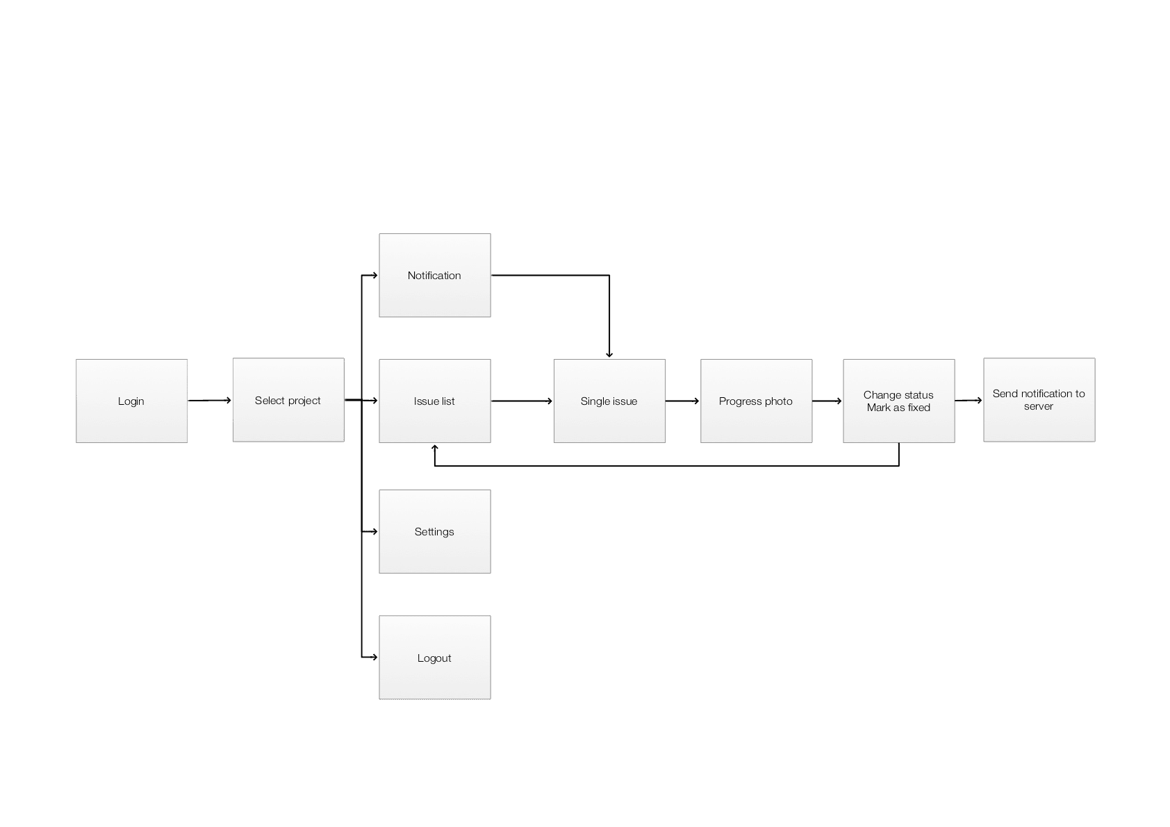
The workflow on this project was the product. The screens were where the flow surfaced. The diagram below is the assigned-issue resolution loop from ticket MBL-2033, as it shipped. Every step has an actor and a real requirement, which is how we decided what to keep and what to cut.
- 01
Issue created in desktop Latista
A superintendent walks the site, finds a defect, logs it in the desktop Latista system, and assigns it to a subcontractor's foreman with a location, description, and due date.
GC / Superintendent - 02
Login and select project
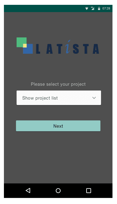
The foreman opens the Android app with credentials from the GC. The first-launch flow requires a project pick from a dropdown because foremen often work across multiple active jobsites. That choice sticks until they change it.
Foreman - 03
Browse assigned issues
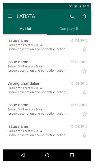
The Issues list has two tabs: My List (what's assigned to me) and Company List (everything my subcontractor company owns). Each row leads with location: building, section, hall. A foreman sorts by where to walk next, not by issue name.
Foreman - 04
Open a single issue
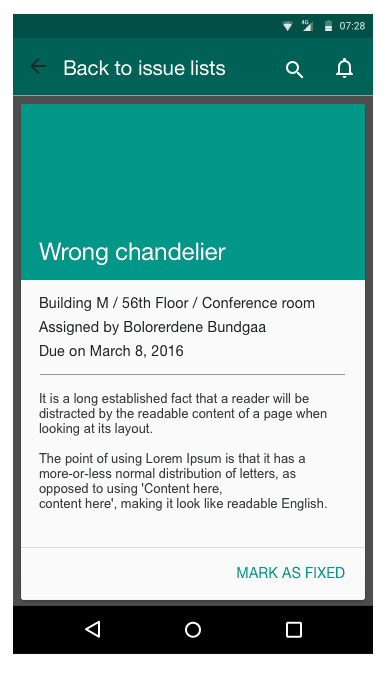
Tapping an issue opens a screen with the location down to the room, the assigner's name, the due date, and the correction needed. One primary action dominates: MARK AS FIXED. It is sized for gloved hands and tuned for high contrast in sun.
Foreman - 05
Do the physical work
The foreman walks to the location and does the fix. The app can't help with this part. Its job is to get them out of the app and back to work quickly.
Foreman - 06
Photo-required prompt
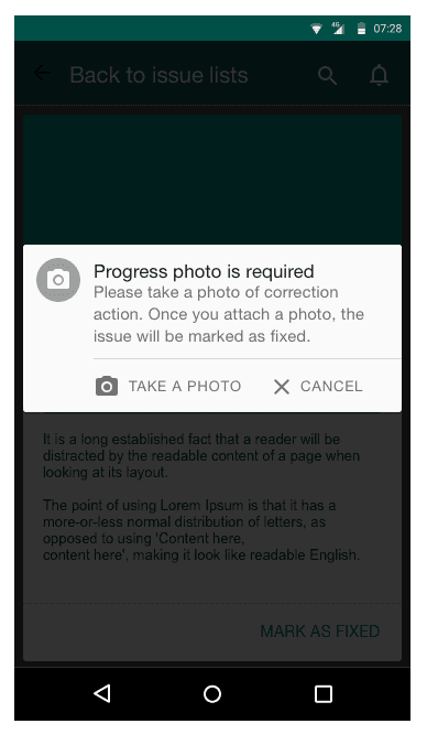
Tapping MARK AS FIXED opens a modal: "Progress photo is required." Options are Take a Photo or Cancel. Without a photo there is no closure. That is the QA gate.
Foreman + System - 07
Camera capture and queued sync
The native Android camera opens. The foreman shoots the completed work and the photo attaches to the issue. If WiFi-only sync is on, the upload queues until they're back near a router. Ask-before-upload can force a confirmation to protect data plans.
Foreman - 08
Closure and GC verification
The issue moves to Fixed on the desktop side with the photo attached as evidence. The superintendent verifies on the next walk. If it's genuinely fixed the loop closes. If not, the issue re-opens with a comment and the cycle restarts.
GC / Superintendent
From tangled to shipped.
Map the workflow before drawing any screen
Before opening Sketch I mapped what a foreman actually does in a day. They show up on site, find out what's on their plate, walk to a location, do the work, and someone verifies it. The app had to compress that loop rather than add ceremony to it. I wrote the flow out as a linear sequence — Login, Select Project, Issues list, Single issue, Mark fixed, Photo required, Camera, Done — and stress-tested each step by asking what would break if a foreman skipped it.
Field research and stakeholder interviews
I talked to Latista's PMs and support team about what was going wrong in the field. The recurring theme was proof. GCs were closing issues in the desktop system based on a subcontractor saying "yeah it's done," and then finding the same defect two weeks later on a walkthrough. The photo requirement came out of that pattern. I also learned that foremen often float between two or three active projects, which is why "which project am I in right now" needed to be a first-class decision rather than a buried setting.
Wireframes and visual system
I wireframed in Sketch (MBL-2033.sketch, 2033.sketch in the archive) and kept the visual language plain: Material Design, teal-green primary, Roboto, standard Android system navigation. No custom controls unless there was a specific reason. The single-issue detail took the most iteration. Early versions had metadata everywhere. The final version showed location, assigner, due date, what to fix, and one button.
Edge cases and offline behavior
I worked through the edge cases the flow diagram surfaced. What happens when a foreman taps Mark As Fixed with no signal? Queue the photo, sync when WiFi returns. What if they belong to twelve projects? Searchable dropdown that remembers the last-used project. What if a notification lands while they're mid-camera? Don't interrupt the capture. Most of the design at this stage was writing rules rather than drawing screens.
Spec and handoff
I handed off to engineering with the flow PDF, the Sketch source, and a written spec on the sync rules. The ticket (MBL-2033) tracked the build. What I would do differently now: spend more time on the notifications side. I designed the list but under-specified the push-notification copy, and the dev team figured it out in-flight. It worked, but I should have owned it.
The moves that worked.
Issues sorted by location, not by description
Each row in the Issues list leads with building, section, and hall. A foreman on the 56th floor sorts by where to walk next rather than by issue name. Moving location to the top of the row changed how fast the list scanned.
One screen, one decision, one button
The single-issue detail is stripped down: location, who assigned it, when it's due, what to fix, and one primary button (MARK AS FIXED). No comments thread, no attachments panel, no status dropdown. Anything the foreman didn't need to make the next decision was cut.
Photo-required closure
An issue can't be closed without an attached photo. Tapping Mark As Fixed brings up the prompt: Take a Photo or Cancel. The GC side needed verifiable evidence, and enforcing it at closure was the cleanest place to put that requirement.
Field-aware settings
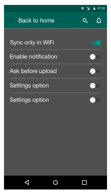
Sync only on WiFi. Ask before upload. Enable notifications. Three toggles that read as ordinary settings but represent the entire offline strategy exposed as user control. Construction sites eat cellular data and drop uploads mid-flight, so giving foremen explicit control worked better than any silent "smart" sync we could have built in 2016.
Multi-project context as a first-class concern
Project selection is the first thing after login and can be changed from the navigation any time. Foremen who work across multiple jobs never have to guess which context they're in. The dropdown is searchable because some GCs name projects "HQ-Tower-East-Phase-2-Retail-Level."
Voice search for gloved use
Search supports Android's built-in voice recognition. A foreman with dirty gloves can hold the phone up and say "chandelier" to filter their list. It costs nothing because it's OS-native, and it makes the app usable in the exact conditions where typing isn't.
Screens and scraps.
What shipped. What changed.
What shipped: an Android app a subcontractor foreman could open cold, pick their project, see their assigned issues, walk to the location, fix the item, take a photo, and close the issue. No training call. No PDF manual. The photo-required rule became the most valuable feature of the app, because it gave GCs verifiable evidence that work had happened. Field settings for WiFi-only sync and ask-before-upload meant crews on data-hostile sites weren't burning plans or losing captures.
I don't have hard adoption metrics from this distance. This was 2016. Latista later became Textura and then Oracle, and I would rather leave the metric blank than invent one. What I can say: the shipped app matched the flow diagram in MBL-2033 almost step for step, which is unusual for construction software of that era.
“If I were doing this project again today, I would design offline-first from day one. The sync rules got layered on later rather than baked in, and that showed up in a settings screen full of toggles that a better-designed system would have hidden. I would also spend real time on the notification copy and the empty states, both of which I treated as afterthoughts. The one habit I would keep is mapping the workflow before opening Sketch. Every good decision on this project traced back to that flow diagram. Every weak decision traced back to a screen I designed before I understood where it sat in the loop.”
Quick Punch — draft issues at punch-walk speed
Cutting the intake time for a single issue in Oracle Prime Field from three-plus minutes down to a few seconds, without losing anything QA needed later.