NielsenIQ OmniData BI — Data Selector
A 336px side panel that lets retail analysts compose Nielsen syndicated queries without writing SQL.
- Role
- Senior Product Designer — owned the Data Selector spec end to end (interaction model, component system, engineering handoff)
- Year
- 2022
- Platform
- Web — NielsenIQ Discover enterprise BI platform
- Industry
- Enterprise BI / Retail & CPG Analytics
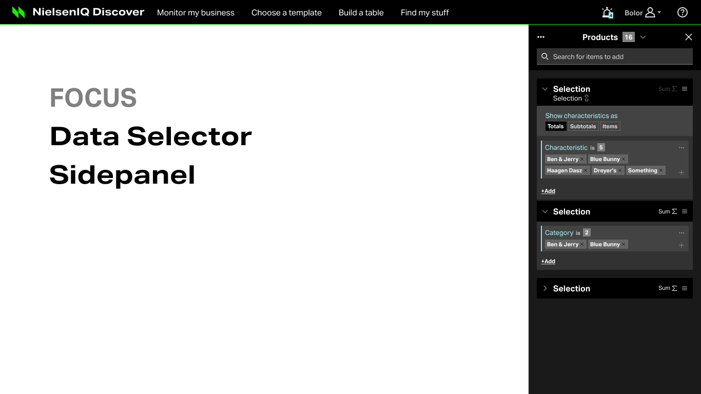
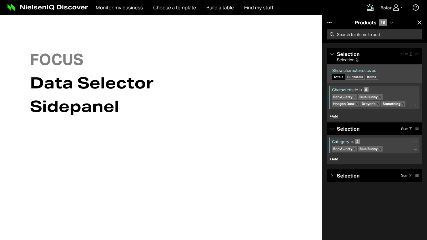
OmniData is NielsenIQ's enterprise data platform. Analysts at large CPG brands and retailers use it to answer questions like "how did Ben & Jerry's chocolate perform against every other premium ice cream brand in the Northeast last quarter?" I designed the Data Selector, which is the side panel where those questions get built. I spent months mapping how analysts think about their data before I drew a single component, and the 84-page spec I handed to engineering became the source of truth for the feature.
NielsenIQ Discover is where the analysis happens: Monitor my business, Choose a template, Build a table, Find my stuff. Every one of those workflows funnels into the same underlying problem, which is to tell the system exactly which products, markets, facts, and time periods you want to look at. That definition step is called a prompt, and prompts are where power users live.
Before I got involved, defining a prompt meant knowing Nielsen's dimensional taxonomy in detail (Department, Category, Sub Category, Brand High/Low, UPC, Brand Family, plus Health & Wellness attributes like Gluten HW, Organic Claim, and Stevia HW), and then building SUM logic in your head to get the "All Others" totals that Nielsen syndicated reporting is known for. Analysts either wrote SQL-adjacent expressions or handed the request to a data engineer and waited.
The business stakes were straightforward. OmniData is what NielsenIQ sells to Unilever, PepsiCo, and Kroger. If the analyst can't self-serve a prompt in a few minutes, the platform loses to Excel exports and internal data teams. My mandate was to make the Data Selector something a smart analyst learns in a day and uses every day.
What was broken.
The hard part of this project was not drawing a nice side panel. A Nielsen prompt is a small program. It has variables (Selection Groups), functions (SUM with a chosen basis), operators (Sum Or, Drill By, When/Else, And/Or splitters), validation rules (Min/Max selection banners), and dependencies (Facts that require certain Markets). All of that has to fit inside 336 pixels of width, docked right, without becoming a form.
The second problem was consistency across the platform. The Boolean logic that composes Selection Groups in the Data Selector also drives the Conditions Editor and Conditional Formatting inside the Table Builder. If I invented a splitter pattern that only worked in one surface, engineering would build it three different ways and every team would drift.
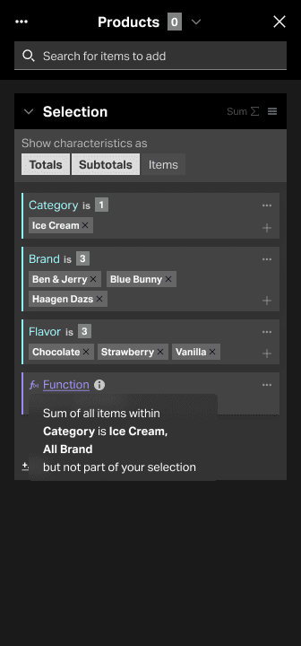
The third problem was the SUM function, and it took the longest to work through. In Nielsen reporting, "All Others" isn't a checkbox. It's a decision about the basis of the sum: are we summing against Ice Cream, Ice Cream All Brands, Ice Cream All Flavors, or a custom subset? Analysts get that wrong and the numbers are wrong, and the client deck is wrong. The interface had to make that basis choice unmissable without opening a modal every time.
Workflow first — map how the analyst thinks, then draw the panel
I don't start with screens on products like this. The interface only came together once I had the analyst's thinking mapped step by step. The Data Selector is a panel, but the actual product is the sequence below. Every component I drew (Prompt Header, Selection Group, SUM dropdown, Splitter, Characteristic Browser) earned its place by answering a specific step in this flow.
- 01
Enter Discover with a question
The analyst lands in NielsenIQ Discover from Monitor my business or Build a table with a real business question in her head. Usually brand versus competitive set in a specific market over a specific period.
Analyst (Taylor, category manager at a CPG) - 02
Open the Data Selector, pick a prompt type
She opens the 336px right-docked side panel. The locked Prompt Header shows the prompt name, a live count of returned items, and a dropdown to switch between Products, Markets, Facts, and Periods. She picks Products first because that is what she is most sure about.
Analyst - 03
Search or browse the characteristic tree
She uses search or drills through the taxonomy (Department, Category, Sub Category, Brand, UPC) with BC / CC / HW badges telling her which attributes are Base, Custom, or Health & Wellness. She adds Ice Cream as the Category, then Ben & Jerry's, Blue Bunny, and Häagen-Dazs as brands.
Analyst + Characteristic Browser - 04
Group the selection and choose display
The selections collapse into a Selection Group accordion card. She flips the "Show characteristics as" toggle to Totals, Subtotals, or Items depending on whether she wants brand-level rows or a single rollup.
Analyst - 05
Turn on SUM and choose the basis
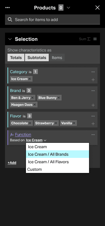
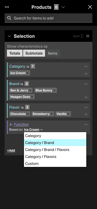
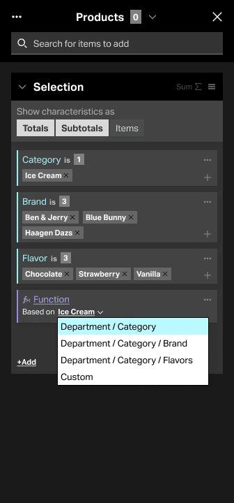
She enables SUM on the Selection Group. The inline dropdown asks the question that used to be invisible: sum against Ice Cream, Ice Cream All Brands, Ice Cream All Flavors, or Custom. The "All Others" decision, made explicit and one click deep.
Analyst + SUM inline dropdown - 06
Compose logic across groups with Splitters
She drags Splitters (Sum Or, Drill By, When/Else, And/Or) between Selection Groups to build compound queries — for example, "these three premium brands When market is Northeast Else national." The same Splitter shows up later in the Conditions Editor and Conditional Formatting.
Analyst + Splitter component - 07
Validate, save, reuse
Min/Max validation banners fire when a group is invalid (too few markets for a fact dependency, for example). She saves the selection, favorites the folder item, and moves to the next prompt (Markets, then Facts, then Periods) while the header counter tracks how many items each prompt returns.
System + Analyst - 08
Hand the prompt to the table
She closes the panel. The prompt drives the table or dashboard tile. If she wants conditional formatting on the result, the same Splitter logic she just learned is waiting for her in the Table Builder. No new mental model.
Analyst + Table Builder
From tangled to shipped.
Living inside the taxonomy
Before I touched Figma I spent weeks with the Nielsen dimensional taxonomy and real analyst prompts pulled from production. I had to understand why BC, CC, and HW badges matter, why Brand Family sits next to Brand High and Brand Low, and why Fat Presence and Stevia HW are first-class attributes rather than filters. Without respecting the data model, the interface would fight it.
Mapping the flow, not the screens
I wrote the eight-step workflow on a wall and worked through every step with the product team and two senior analysts. Same question at each step: what decision is the analyst making right now, and what does she need visible to make it? That is where the locked Prompt Header, the live counter, and the inline SUM basis dropdown came from. Each one answers a specific question at a specific step.
Building the component system
Once the flow was solid I built the component library that became the 84-page spec: Prompt Header, Selection Group, Characteristic Card, SUM dropdown, Splitter, Add Screen characteristic ordering, Selection Title options, Folder Item favorites, Lazy Loader, validation banners. I designed each component with its states, its edge cases, and its reuse contract. The Splitter got extra attention because I knew engineering would want to use it in three surfaces, so I specced it once, thoroughly.
Pressure-testing with real prompts
I rebuilt real Nielsen prompts in the design: the ice cream competitive set, a Health & Wellness organic-claim rollup, a Custom buyers-and-shoppers group with nested SUM. That is where I caught the problems a happy-path demo hides: nested SUM readability, fact dependencies that silently break a market selection, and how the panel behaves when a Selection Group has forty items in it.
Handoff as the source of truth
The final artifact was the "Best thinking" document: 84 pages, three sections (Prompt UI, Sidepanel, Local Components), each with 10 to 14 sub-topics. Written so engineering could open it at 2am and not need me. I would rather over-document once than answer the same question in Slack for six months.
The moves that worked.
A locked Prompt Header the analyst can always find
The header stays in place while the panel scrolls. Prompt name, live count of returned items, dropdown to switch between Products / Markets / Facts / Periods, an overflow menu for save / create new / clear all, and a search bar. This is the analyst's constant orientation: where am I, how many items do I have, and how do I jump to the next prompt.
Selection Groups as accordion cards
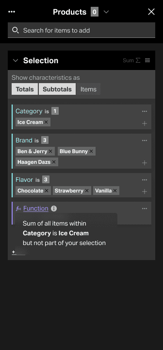
Each Selection Group is a self-contained accordion card holding Characteristic cards: Category is Ice Cream; Brand is Ben & Jerry's, Blue Bunny, Häagen-Dazs; Flavor is Chocolate, Strawberry, Vanilla. Collapsing keeps the panel scannable when a prompt has six groups. The "Show characteristics as" toggle (Totals / Subtotals / Items) lives on the card because that is where the decision belongs.
SUM basis as an inline dropdown
The pillar of this feature. The SUM basis choice (Ice Cream, Ice Cream All Brands, Ice Cream All Flavors, Custom) sits on the group, one click, always visible. No modal, no hidden setting. The "All Others" decision that used to live in the analyst's head is now on the surface, where it can be reviewed and corrected.
Splitters as reusable logic operators
Sum Or, Drill By, When/Else, And/Or. One component, drag-and-drop between Selection Groups. Specced once and reused in the Conditions Editor and the Table Builder's Conditional Formatting so the analyst learns the pattern in one place and applies it everywhere.
A Characteristic Browser that respects the taxonomy
Department to Category to Sub Category to Brand to UPC, with BC / CC / HW badges showing whether an attribute is Base, Custom, or Health & Wellness. Search sits on top of the same tree. This matches how analysts already think about their data, so the interface stays out of the way.
An 84-page spec engineering could actually build from
Three sections (Prompt UI, Sidepanel, Local Components), each with 10 to 14 sub-topics covering states, edge cases, and reuse contracts. Not a pitch deck, a production document. It was the source of truth for the feature and it kept the build honest.
Screens and scraps.
What shipped. What changed.
What shipped: the Data Selector Side Panel as specified, the component library (Prompt Header, Selection Group, SUM dropdown, Splitter, Characteristic Browser, Local Components), and the reuse of the Splitter pattern in the Conditions Editor and Table Builder Conditional Formatting. The 84-page "Best thinking" document became the reference engineering worked from, and the pattern other prompt surfaces in Discover borrowed from. I don't have public performance metrics to share, and I would rather leave that blank than invent one.
“The lesson I take from this one: when a product is essentially a small programming language wearing an interface, you have to design the mental model before the pixels. The SUM basis dropdown looks like a small UI decision. It is really a decision about whether the analyst can trust her own numbers. I got the first version wrong. It hid the basis behind an edit affordance and analysts kept forgetting to check it. Moving it inline, always visible, is what made the panel work. Workflow first. The panel is downstream of the flow.”
USDA FNS Innovation Hub — a portfolio of federal service projects
Design work inside the Food & Nutrition Service Innovation Hub — SNAP, WIC, school meals, and the tooling that runs them.